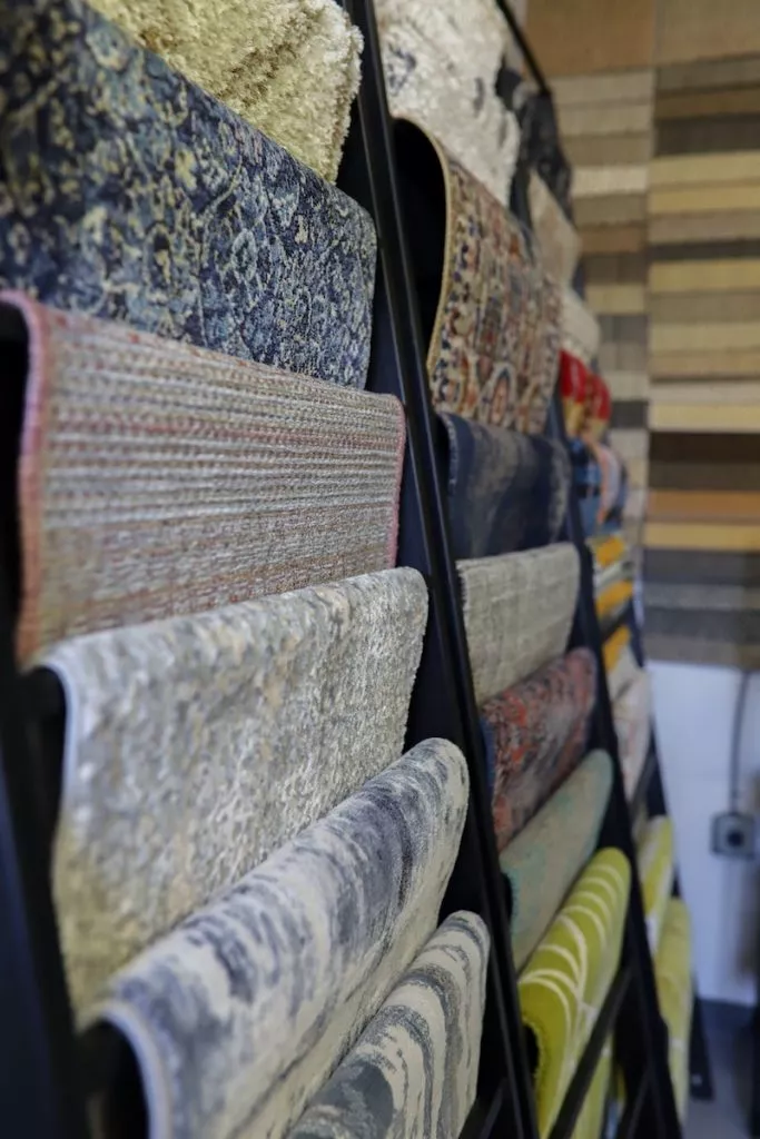
We are all aware of the colors that flatter us and the colors that don’t. I thought it would be fun to apply those same rules to carpet. Next time you are in the market for a new carpet, maybe you can venture away from the most commonly used colors? Here are some carpet color ideas:
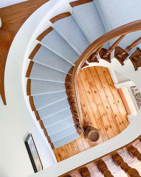
Blue is one of those colors that just happens to flatter every skin tone. There are so many shades and that is why blue carpets are in such high demand! Most blues have a softer feel, opposed to gray.
Speaking of blue…aqua is a perfect way to bring the ocean into your home! An entire aqua carpet may become overwhelming so using it as a pop color is the best way to bring in some serenity.
Warm tones are kind to everyone. Pink can be tricky though. Most people, when they hear pink, they think Barbie or Bubblegum. But…
-Coral on the other hand is both cozy and chic!
-Although pearl is soft, in the right space, it can hold it’s own. The stair runners below are perfect examples.
-Pale pink paired with a more prominent contrast color can be completely unexpected. Light pink is considered cool so they pair nicely with other colors in the same family.
Fiery colors have a way to make us feel good about ourselves. Confidence stands out and this goes for carpet too!
Last but certainly not least, green is the color of balance and harmony. Let’s be honest, who doesn’t look great feeling grounded?


