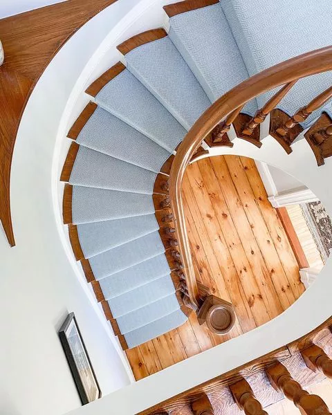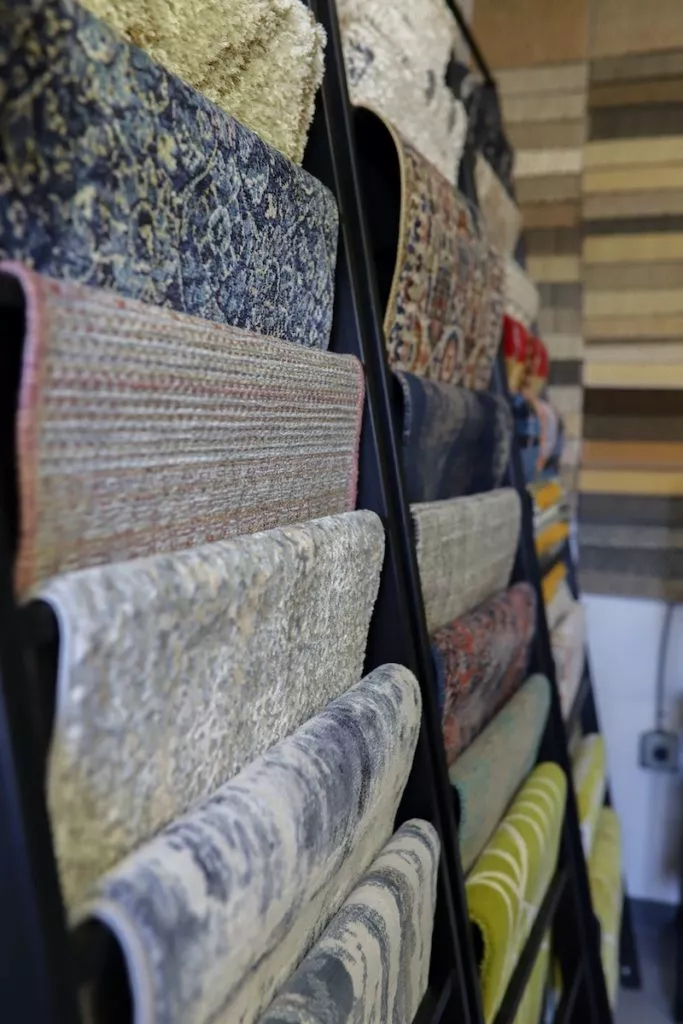
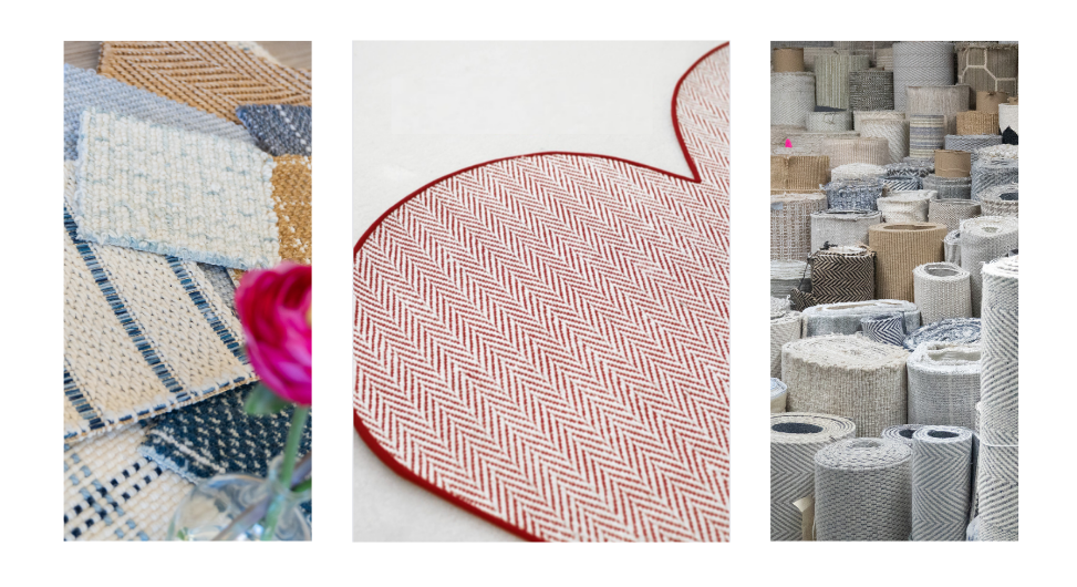
A guide to choosing carpet patterns for custom rugs, stair runners and wall-to-wall carpet.
Choosing carpet patterns involves more than finding a design you like. The repeat size, color contrast and layout influence how the finished piece looks in your home. A pattern that feels busy on a sample might look balanced across a room. Another may become more noticeable once it covers an entire staircase.
Start by deciding what the carpet should contribute. Do you want a focal point, a connection to your furnishings or a quieter backdrop? This guide compares the main options and explains what to consider before choosing.
Carpet Patterns at a Glance
| Pattern | The look | Consider for | Keep in mind |
|---|---|---|---|
| Herringbone | Staggered, broken zigzag | Classic rugs and runners | Contrast determines how prominent it looks |
| Chevron | Continuous V shapes | A clear directional statement | Check centering and repeat size |
| Stripes | Parallel bands | Hallways and stair runners | Plan direction around turns |
| Plaid | Crossing bands in a layered grid | Connecting several room colors | Compare with nearby patterned fabrics |
| Checkerboard / box | Alternating squares or outlined shapes | A graphic focal point | Check scale and cuts at edges |
| Strié | Streaked color variations | A quieter patterned backdrop | View the effect at a distance |
| Animal print | Organic spots or stripes | Adding personality | Marking size and contrast affect intensity |
| Floral / botanical | Flowers, leaves or vines | Introducing curves and decorative detail | Furniture may cover larger motifs |
| Geometric | Repeated diamonds, trellis or other shapes | Adding structure | Consider nearby tile and wallpaper |
| Solid / tonal | One color or closely related shades | Balancing patterned furnishings | Color and surface still influence the look |
These are styling considerations. Fiber, construction and manufacturer specifications determine suitability for stairs and everyday wear.
Herringbone: A Classic with Direction
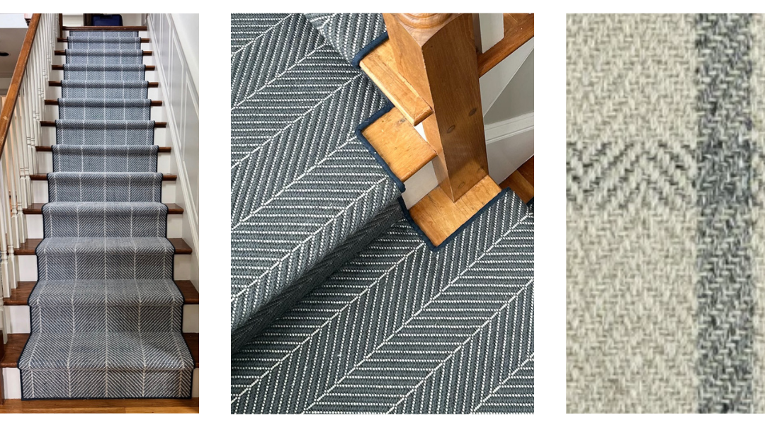
Herringbone creates a staggered zigzag with a broken alignment. A small repeat in similar tones can look understated, while contrasting colors emphasize the design. Consider it for rugs or runners when you want structure without a large motif. View enough of the sample to see how the repeat works across your planned width.
Chevron: A More Defined Zigzag
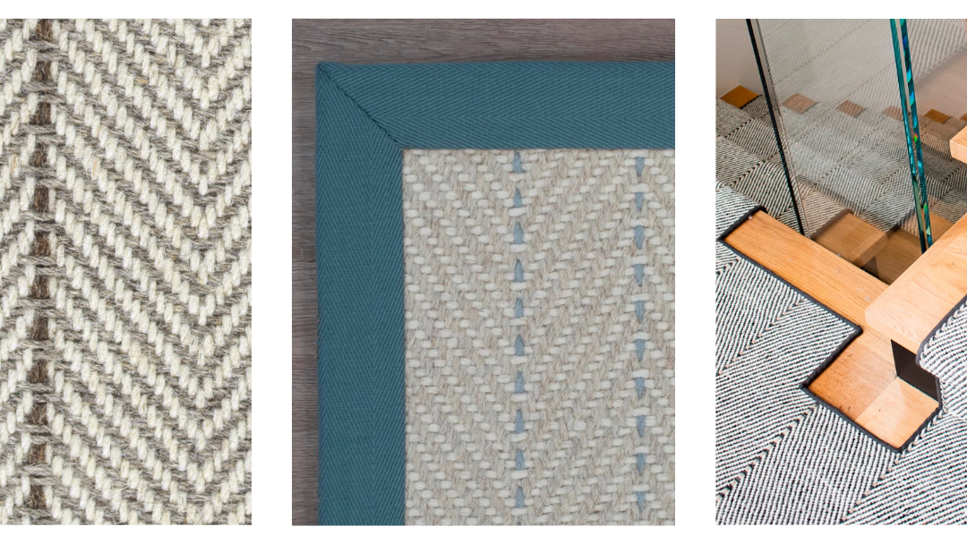
Chevron forms continuous V shapes with a clear meeting point. Architectural Digest illustrates the difference between chevron and herringbone through flooring examples. Consider chevron when you want a pronounced directional pattern. Check centering and scale, especially on a narrow runner where only part of the design may fit.
Stripes: Simple Lines with Plenty of Options
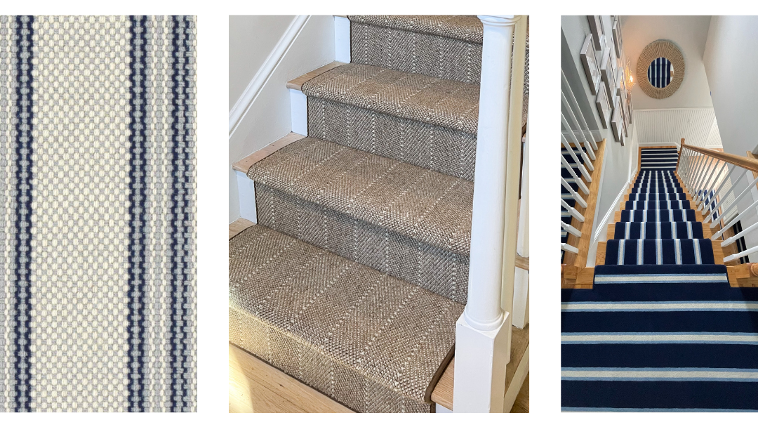
Stripe width, spacing and color can change the character of a rug or runner. Narrow lines may read quietly, while wider bands make a clearer statement. Consider stripes for hallways or stairs where direction forms part of the design. Plan how they will follow turns and connect with landings before ordering.
Plaid: A Pattern That Connects Colors
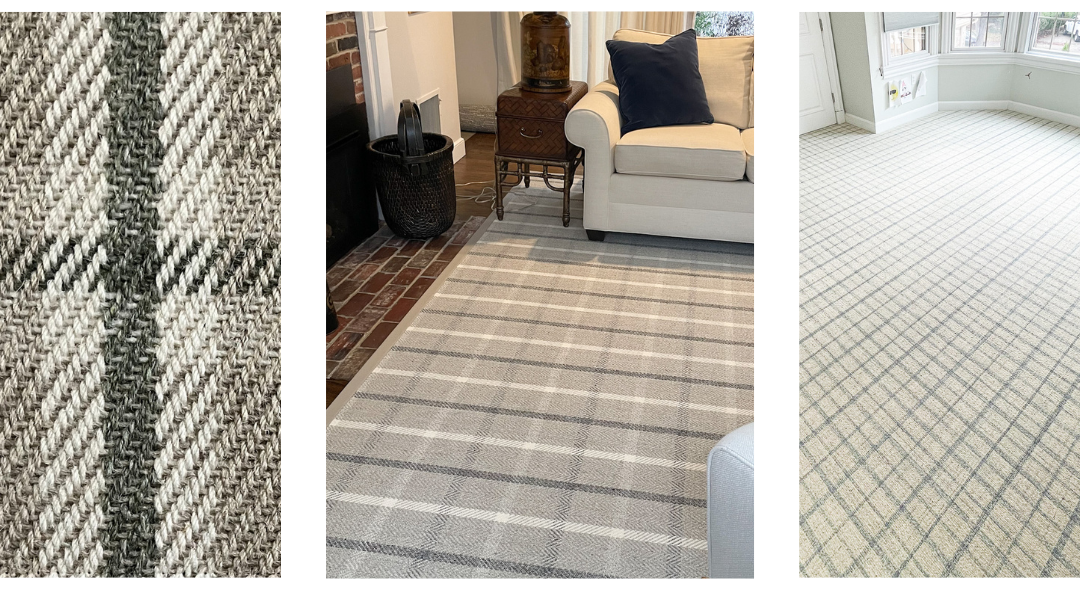
Plaid combines crossing bands into a layered grid, often using several colors and widths. Consider it when you want to bring existing room colors together. A shade in the plaid can connect with upholstery, paint or accessories. Keep nearby patterns in mind so similar-sized grids do not compete unnecessarily.
Checkerboard and Box Patterns: An Orderly Graphic Look
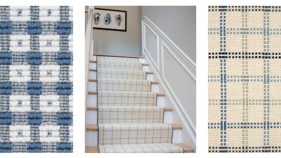
Checkerboard uses alternating squares, while box patterns often feature repeated square or rectangular outlines. Consider either when you want a clearly organized design. Similar tones soften the effect, while contrasting colors emphasize each shape. Check how the pattern meets the rug edges and how much remains visible around furniture.
Strié: Variation Without a Distinct Motif
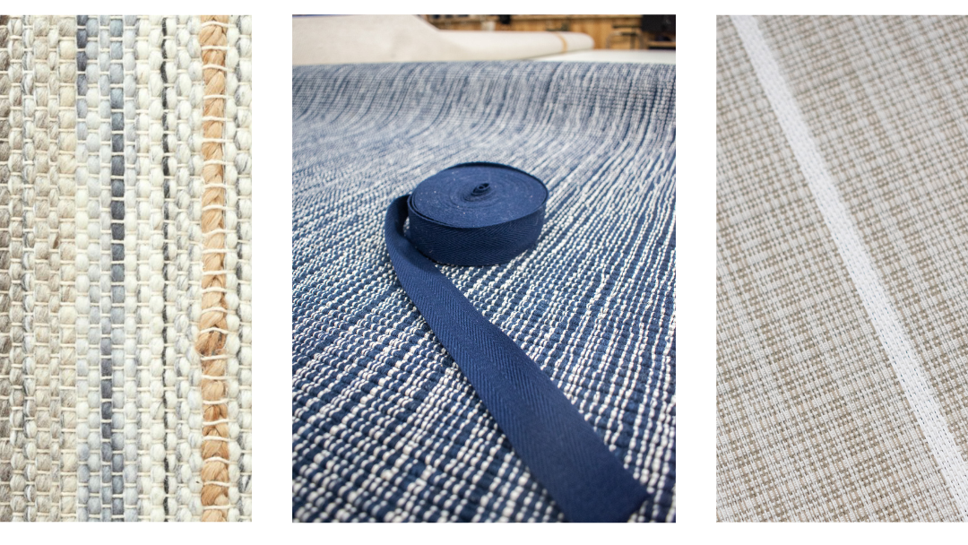
Strié describes a streaked or softly striped effect created through tonal or color variations. Consider it when a solid feels too plain but a defined pattern feels too prominent. It can provide a quieter backdrop beside patterned upholstery. View samples across the room, where individual streaks may blend into an overall effect.
Animal Print: Personality Through Organic Shapes
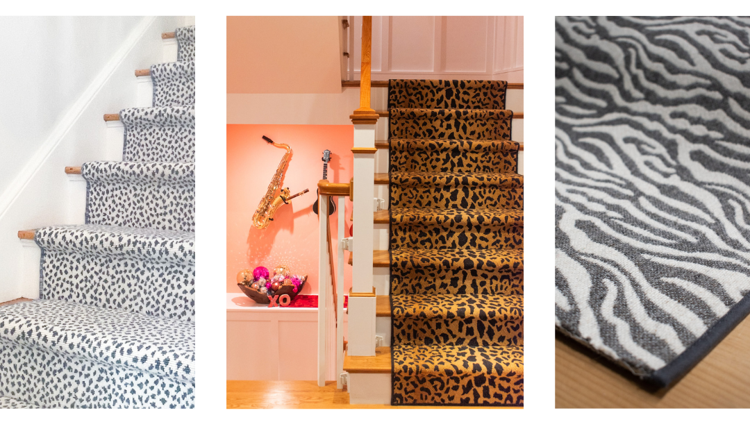
Animal prints use markings such as spots and stripes to create a distinctive look. Consider them for a rug or runner you want people to notice. Neutral colors can make the print easier to coordinate with existing furnishings. Keep marking size and contrast in mind, since both affect how strongly it stands out.
Floral and Botanical: Curves and Decorative Detail
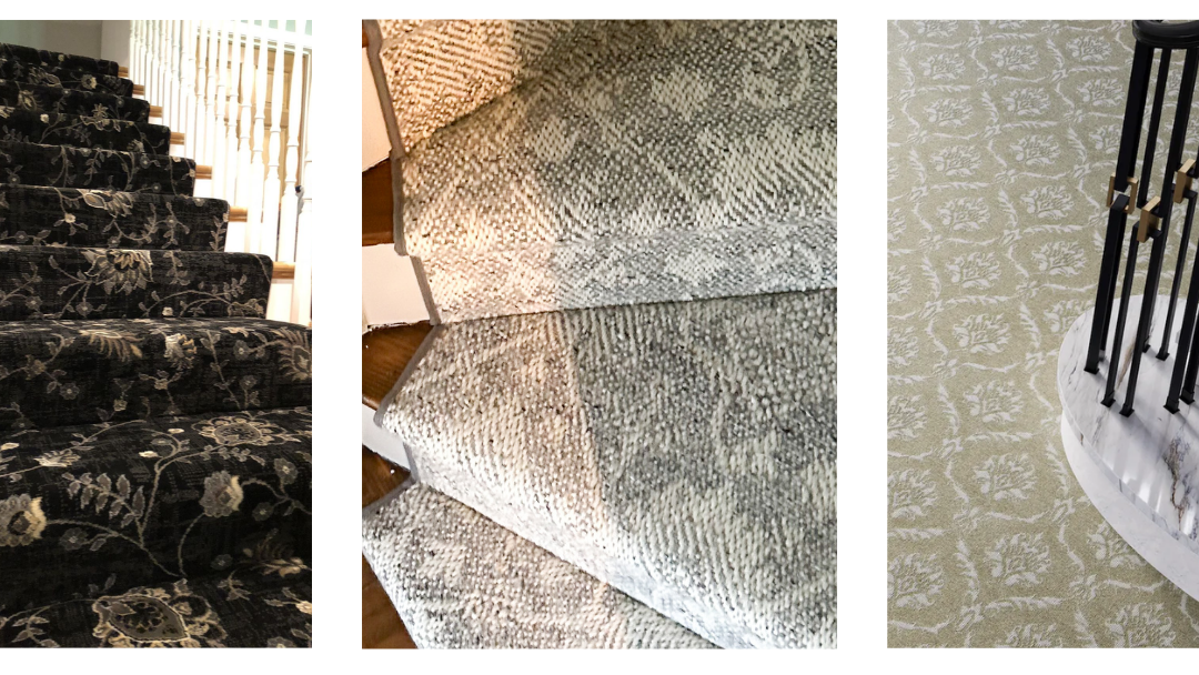
Flowers, leaves and vines introduce softer shapes alongside a room’s straight lines. Consider these patterns when you want an organic element or a decorative focal point. A shared color can connect them with upholstery or curtains. Check furniture placement so a larger motif does not disappear beneath the sofa.
Geometric: Repetition That Gives a Room Structure
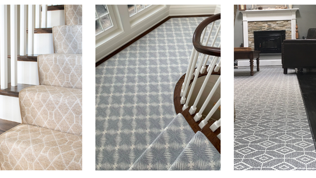
Diamonds, trellis and hexagons are familiar geometric options. Herringbone and checkerboard also belong to this broader family, but their distinct layouts deserve separate comparisons. Consider geometry when you want a repeated shape to organize the design. Compare it with existing tile, wallpaper and furniture details before committing.
Solid and Tonal: Let Color Lead
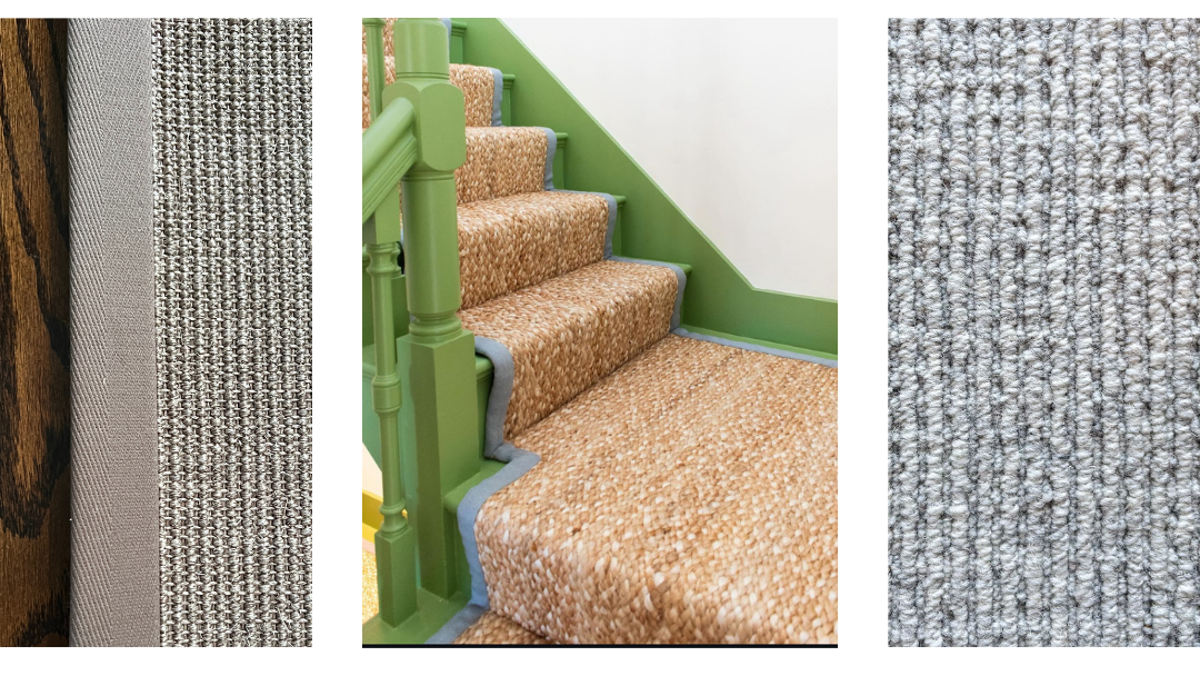
Solid carpet uses color without a prominent motif, while tonal styles introduce closely related shades. Consider either to balance patterned furnishings or draw attention to an interesting edge finish. A strong color can still make a solid rug the focal point. Check the sample in different lighting, since its surface can affect its appearance.
How Do You Balance Pattern and Color?
Decide what should catch your eye first. If wallpaper or upholstery already leads the room, consider a lower-contrast carpet. If the rug will be the main feature, give its pattern space beside quieter furnishings. A large design in similar tones can look calmer than a small repeat with sharp contrast.
When combining patterns, try a shared color and different scales. A smaller carpet repeat might sit comfortably alongside a larger floral or widely spaced stripe. Homes & Gardens discusses these pattern-mixing principles, including the value of plain surfaces. Compare samples together rather than making each choice separately.
Is the Pattern Created by Construction or Color?
Patterns can come from pile-height differences, cut-and-loop combinations, colored yarns or printing. The Carpet and Rug Institute explains how construction creates pattern effects. Weaving and dyeing can work together, so they are not opposing categories. Brintons’ undyed wool collection also shows how natural yarn shades can create woven patterns.
What Should You Check Before Ordering your Carpet?
Review the finished dimensions, repeat size and direction with your project team. For stairs, include centering, hardwood reveal, landings and turns. Roger Oates’ technical gallery illustrates ways flatweave runners can change direction. The right layout depends on the specific carpet and staircase.
It important to take into account carpet patterns when planning material quantities. The Carpet and Rug Institute’s residential installation standard notes that patterned carpet requires additional material for matching. Discuss the edge finish, too, because a contrasting border frames the pattern differently than a coordinating finish. Resolve these details before placing the order.
Compare Carpet Patterns at The Carpet Workroom
Bring room photos and any paint or fabric samples to our Newton or Stoughton showroom. We can help you compare carpet patterns for custom rugs, stair runners and wall-to-wall projects. You can also ask about a free virtual consultation and samples shipped to your home. Contact info@carpetworkroom.com to start planning your project.